Paul Lukez Architecture (PLA for short) has served a wide range of clients and designed a variety of distinctive works over its 28 years of existence. Thanks to referrals, our business expanded and project types diversified organically over time.
Yet with time pressing, there is an increasing need for society to address climate change and its effects on the environment.
Consequently, PLA has re-dedicated its efforts to contribute its creative powers towards addressing this planetary challenge in partnership with our clients, project by project.
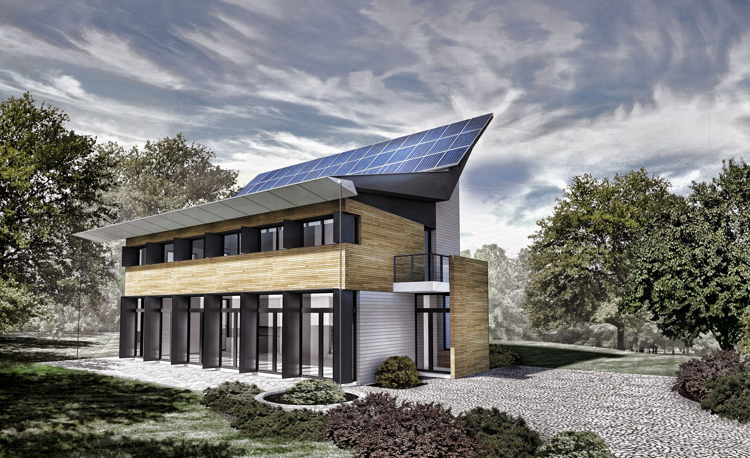
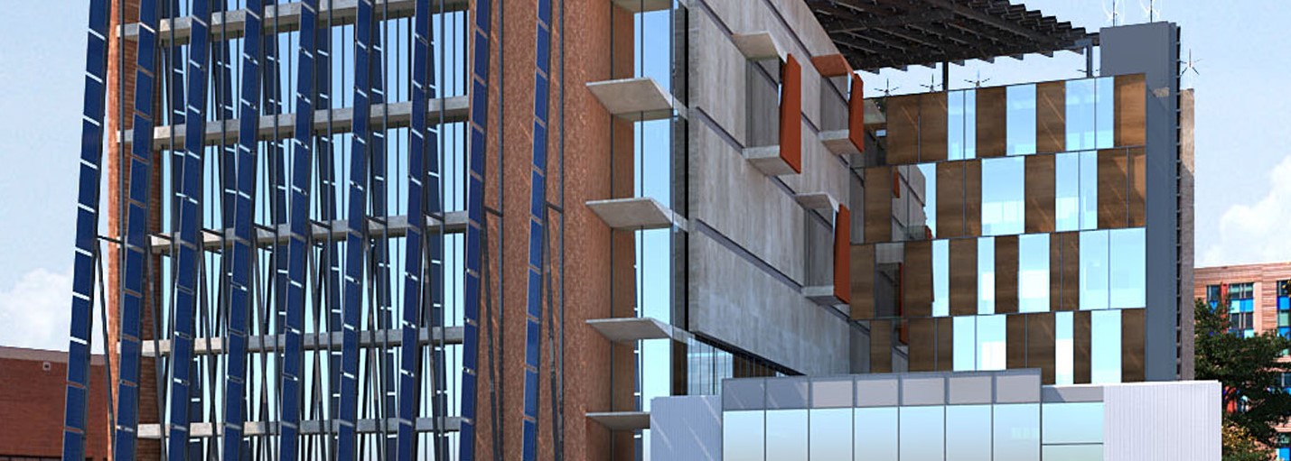
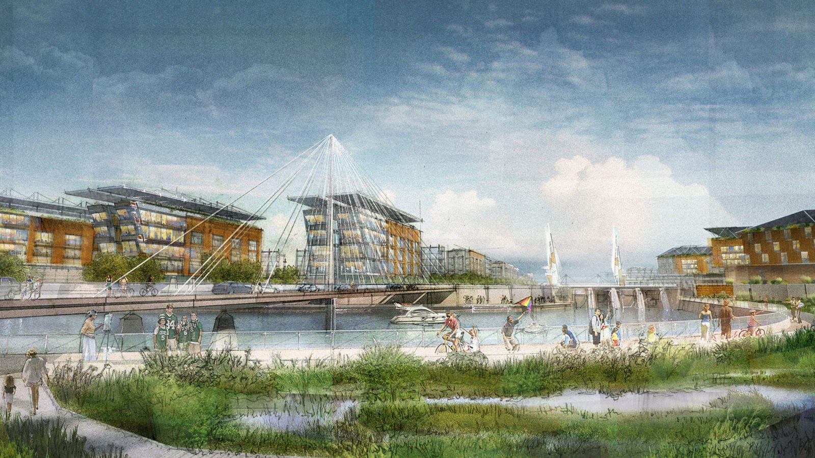
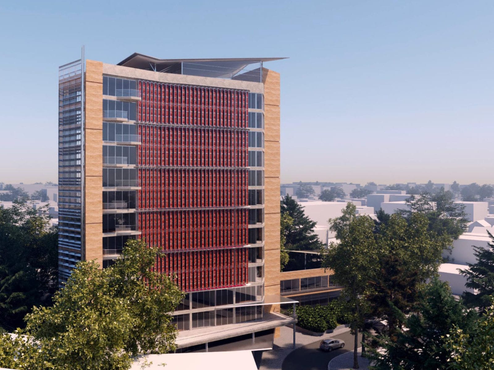
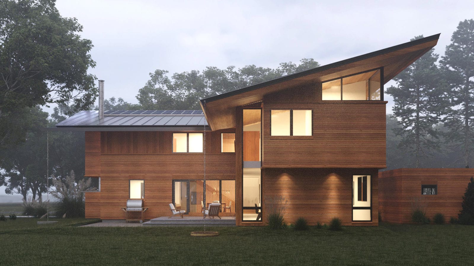
With an extensive portfolio of 30+ sustainable projects, PLA wants to highlight and share its 20 years of sustainable design experience with its community, while attracting others to join us in our search for creating more sustainable built environments. To that end, we have created a new website focusing exclusively on our growing portfolio of sustainable projects – such an important and integral part of PLA.
Allow us to introduce you to:
PLASES:
Paul Lukez Architecture
Sustainable Environment Studio
By now, you may be looking at the spelling of PLASES, thinking that we’ve gone and spelled the word wrong. But you see; the “S” stands for Sustainable Places, and you can’t really spell sustainable by starting with the letter “C”. In short: PLASES creates Sustainable Places.
Won’t you join us in our pursuit of inspired designs that add sustainably to the quality of life for you and our communities?
Developed by Harper Smith, our graphic designer, the design concept intends to embrace our belief in elegant simplicity. Turns out that designing a logo for a nonexistent word was an inspiring challenge.
Luckily, the macron, a small grammatical mark above the A, changed everything for us. To make sure PLASES is pronounced correctly, the macron sits atop the A. Phonetically, this renders the “A” as a long vowel. The macron also becomes a design feature and progenitor of the logo’s distinctive personality.
The logo also needed to function in two modes: as PLA, the original firm, and PLASES, the portion of the firm focused exclusively on sustainable design.
The logo’s use of orange and blue colors distinguishes PLA from SES, such that PLA can be read autonomously as the acronym of our founding firm. When SES is added to PLA, the logo is read as PLASES. Orange (or oranje in Dutch) has long been PLA’s adopted color, while blue calls attention to blue waters and skies, the essentials of our natural environment and providers of much of our sustainable energy (hydropower, solar power, wind power).
The new branding of PLASES enables PLA to direct clients to a website featuring a rich portfolio of exciting sustainable projects. But more importantly, this website and graphic design represents the firm’s commitment to generating memorable sustainable design projects in service of our clients and their communities. We welcome your inquiries and feedback.